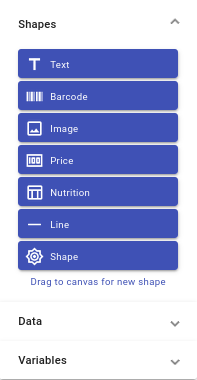
Shapes are the key components for designing your labels. barxui has a powerful set of shapes you can add to your label. Each of these is defined below.
Text Shape
The Text shape can define a single line of text or a block of formatted text.
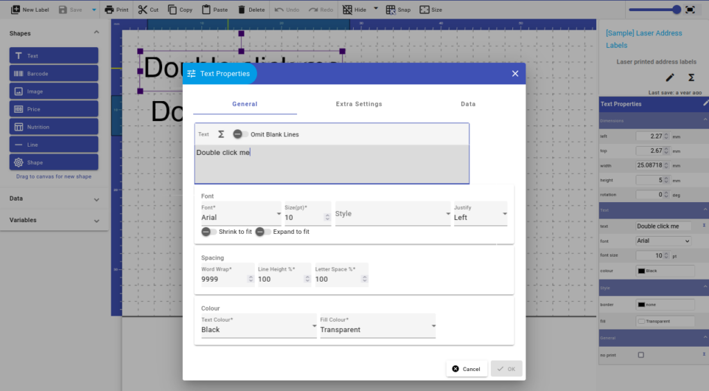
Text Shape common properties:
| Property | Description | Note |
|---|---|---|
| Text | The actual text for the label. This can include data or variables to create dynamic content. | Required |
| Font | The font properties include the font face, size, style and justification. For dynamic text content you can also control the font size of the text content to make it shrink or expand to fit. The selected font face will be used in the dialog as a preview. | |
| Spacing | The spacing properties control white space around characters and between lines. | |
| Colour | Set the text and background fill colours. |
Dynamic Content
The content of the text shape can be:
- static text you enter in the properties
- data from an attached query
- text with embedded data fields or other variables
Additionally, formatting can be applied to sections of the content.
Static Text
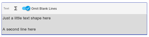
To define static, unchanging text in the shape, simply enter the text in the text field of the shape properties:
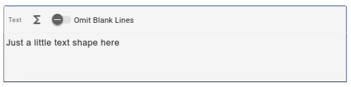
You can enter multiple lines of text also:
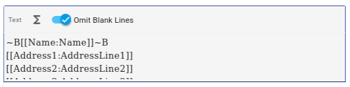
The Omit Blank Lines option is useful when you you have blank data values, such as with an address label. In this case, you would want to close-up the address:
Embedding Data and Variables
The address label sample above includes some strange looking text. This is how you can embed data values and variables into your label text shapes.
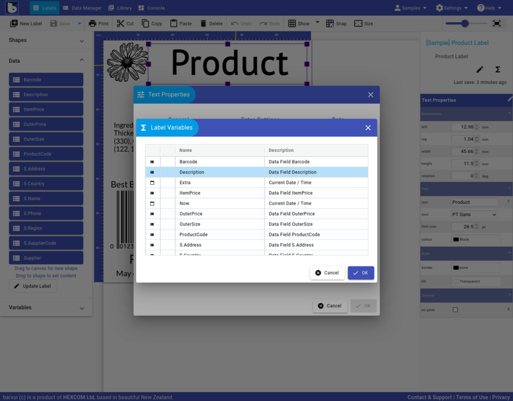
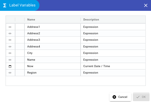
To add a data or variable value, select the spot you want to insert it and click the sigma button  . This will display the Label Variables dialog:
When inserted, the symbols in the text content has a specific format. You can just enter this manually if you follow the rules!
[[Data/Variable Name:Optional Display Label]]The delimiters, [[ … ]], for data & variables should surround the variable name. You can optionally add a display value after the variable name by separating it with a colon ‘:’ character. This display value is used in on the canvas as data and variables are only evaluated when printing.
Formatting
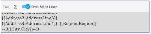
In addition to including data and variables in the text content, you can also highlight part of the content with some formatting toggles. Text is surrounded by these symbols, as in the city in the address sample below:
| Symbol | Description |
|---|---|
| ~B | Bold |
| ~D | Subscript |
| ~H | Hidden |
| ~I | Italic |
| ~P | Superscript |
| ~S | Strike-through |
| ~U | Underline |
Data Values
The data table on the text shape properties dialog allows you to specify the content of the text shape at print time.
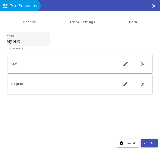
Setting a property value here will override anything entered in the text property. Using the data property to set the text content can be easier than using the text property but its not as flexible. The designer will only display the default text content.
Sizing
Text shapes have a fixed width and height which can be set in the Extra Settings or the property panel. However, with dynamic content the font size of the content may change depending on the Shrink and Expand settings.
Barcode Shape
The Barcode shape prints a barcode or 2D symbol on the label — either a fixed value you type in, or a value pulled from a connected data field.
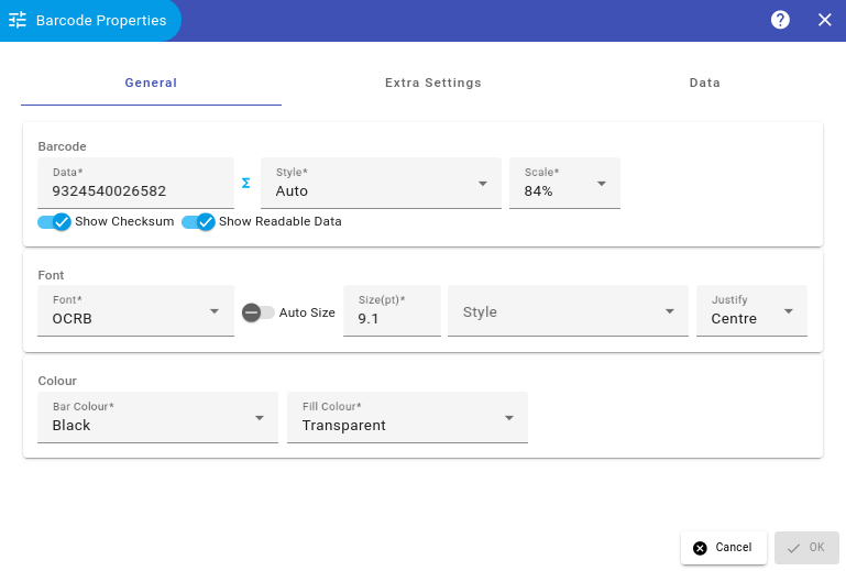
The General tab lets you configure:
- Data — the value to encode; type it directly or click the sigma icon to bind it to a data field or variable.
- Style — the barcode symbology: Auto, Code 128 A, Code 128 Auto, Code 128 B, Code 128 C, Code 128Auto-Mod10, Code 39, Code 93, GS1-128 EAN128, GS1-13 EAN13, GS1-8 EAN8, ITF-Interleaved, MSI, QR-Code, SSCC, UPCA, UPCE.
- Scale — the overall size of the barcode, as a percentage.
- Show Checksum — include a check digit in the encoded value.
- Show Readable Data — print the human-readable digits or text beneath the bars.
- Font — the font, size, style and justification used for the readable data text; Auto Size lets that text grow or shrink to fit.
- Colour — Bar Colour and Fill Colour for the barcode graphic.
Most symbologies (Code 128, Code 39, GS1 variants, UPC/EAN) are 1D linear barcodes; QR-Code and SSCC are 2D/GS1 formats. Not every option applies to every style — checksum and readable data settings, for example, don’t affect QR-Code.
Image Shape
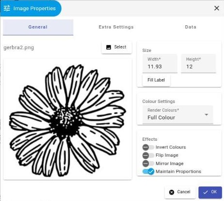
The Image shape places a picture on the label — a logo, icon, or photo. Click Select to choose an image already uploaded to the File Library, or upload a new one. The image picker also has a Clipart tab where you can search and insert free-to-use clipart and illustrations — see the Public Clipart Library page for details.
The General tab covers:
- Width / Height — the image’s size on the label; Fill Label resizes it to cover the whole label area.
- Render Colours — print the image in Full Colour, Gray, or Black & White.
- Effects — Invert Colours, Flip Image, Mirror Image, and Maintain Proportions (keeps the image’s aspect ratio when you resize it).
Price Shape
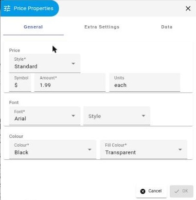
The Price shape formats a numeric value as a price, with a currency symbol and consistent styling.
The General tab covers:
- Style — how the amount is formatted: Standard, Big Dollar, Small Symbol, Plain with Symbol, Plain no Symbol, No Symbol Hi Decimal, or No Symbol No Decimal.
- Symbol, Amount, Units — the currency symbol (e.g. $), the numeric price, and an optional unit label shown after it (e.g. “each” or “kg”).
- Font and Colour — the font, style, text colour and fill colour used for the price.
Nutrition Shape
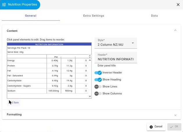
The Nutrition shape builds a formatted nutrition information panel, styled to match common regional layouts, from a set of rows you define.
The General tab covers:
- Style — the panel layout: 2 Column NZ/AU, 3 Column RDI% in middle, or 3 Column RDI% on right.
- Header, Serves, Serve Size, Units — the panel title and the serving details shown in the header rows.
- Content — the list of nutrient rows (Energy, Protein, Fat, and so on); click Add Item to add a row, or drag rows to reorder them.
- Inverse Header, Show Heading, Show Lines, Show Columns — toggle the header colour, title row, row divider lines, and per-100g column.
- Formatting — the font, size, style and justification for the panel text, plus Shrink to fit and Expand to fit.
Lines Shape
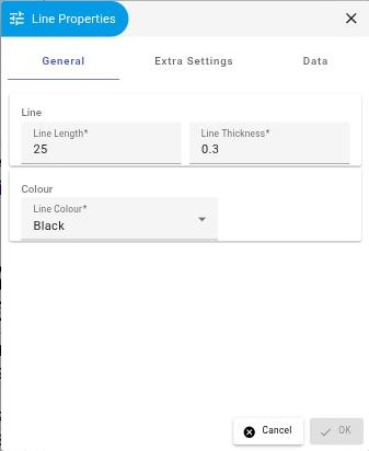
The Line shape draws a straight rule on the label — useful for underlines, dividers between sections, or a cut/fold guide.
The General tab covers:
- Line Length and Line Thickness, both in millimetres.
- Line Colour — the colour of the line.
Geometric Shape
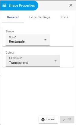
The Shape tool draws a filled or outlined geometric shape on the label, for backgrounds, highlights, or simple decoration.
The General tab covers:
- Style — the shape to draw: Rectangle, Circle, Ellipse, Triangle, or Pointer.
- Fill Colour — the shape’s fill colour (or Transparent for an outline-only shape using the shape’s border, set in Extra Settings).
Extra Settings
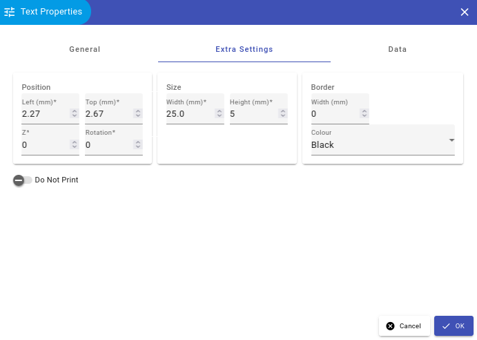
All shapes have common properties for setting the position, size and optional border.
Data Properties
Columns from the data can be attached to shape properties on labels and formatting applied.